
Why Form Abandonment Is Killing Your Lead Pipeline (And What to Do About It)
You've spent money driving traffic to your landing page. The visitor reads your copy, likes what they see, and clicks your CTA. Then they start filling out the form — and leave. This is form abandonment, and it's one of the most expensive problems in lead generation because it happens so late in the funnel, after you've already paid to acquire that visitor.
The difference between a form converting 2% of visitors versus 15% is not a small optimization — it's a revenue multiplier. According to research from monday.com, that spread can fundamentally change your cost per acquisition and the size of your sales pipeline. This guide breaks down exactly why forms fail and what you can do about it today.
The Root Causes of Form Abandonment
Most teams treat form abandonment as a design problem. It isn't — at least not primarily. The real issue is often motivational. Think of it this way: if someone offered you a Ferrari for completing a 50-question form, you'd fill out every field. The form's length didn't change. Your motivation did.
This insight, drawn from Leadformly's Form Optimisation Pyramid, structures form performance into five layers. Motivation sits at the base. Without it, no amount of design polish will move the needle. Above motivation comes usability, then trust, then form-specific UX, and finally conversion mechanics at the top. Teams that skip straight to tweaking field labels while ignoring what's in it for the visitor are optimizing the wrong layer entirely.
The Four Most Common Abandonment Triggers
- Too many fields. Every additional field is a friction point. The more you ask for upfront, the lower your completion rate.
- Poor mobile experience. For most sites, mobile represents the majority of traffic. A form that works on desktop but frustrates on a phone is effectively invisible to half your audience.
- Weak value proposition. If the visitor can't see a clear benefit for submitting, they won't.
- Trust signals missing. No privacy assurance, no social proof, no logo — forms without credibility markers see dramatically higher drop-off.
Simplify First: The High-ROI Form Audit
Before you add anything to your forms, remove things. This is counterintuitive for marketing teams who want more data, but the evidence is clear: shorter forms convert better, and the data you collect from a shorter form is more reliable because it comes from more engaged leads.
Cut Fields You Don't Actually Need
Start by auditing every field on every form. For each one, ask: does the sales team actually use this in the first conversation? If the answer is no, remove it. Common culprits include:
- Password confirmation fields. Research shows fewer than 1% of users mistype their password. The confirmation field exists as a legacy UX pattern, not a genuine user need. Replace it with a show/hide password toggle instead.
- Country fields with manual entry. Capture country from IP address and set it as the default. The user can override it if needed — most won't need to.
- Phone number on top-of-funnel forms. Phone is high-commitment information. Asking for it before trust is established drives abandonment. Reserve it for mid-funnel or qualification forms.
Use Conditional Logic to Personalize Field Sets
If your audience spans multiple segments — different industries, company sizes, or use cases — there are likely questions that only apply to some of them. Conditional logic lets you show or hide fields based on previous answers, shortening the form for each individual visitor without losing the data quality you need for segmentation.
Tools like HubSpot Marketing Hub offer native conditional form logic with their form builder, making it straightforward to build branching forms without custom development.
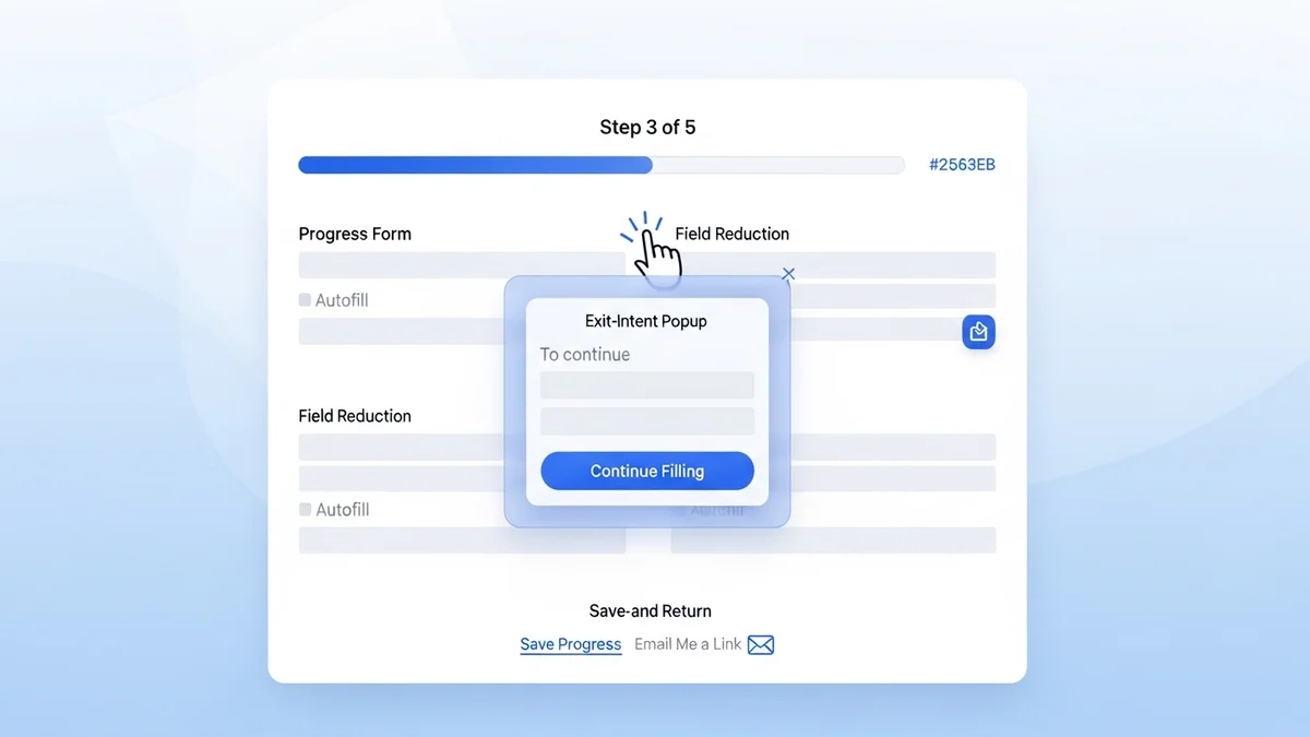
Multi-Step Forms: The Conversion Architecture That Works
One of the most reliable tactics for reducing abandonment on longer forms is breaking them into multiple steps with a visible progress indicator. The psychology is simple: once someone completes the first step, they've invested time and effort. Sunk cost drives completion. The progress bar creates an implied commitment to finish.
Newsletter
Get the latest SaaS reviews in your inbox
By subscribing, you agree to receive email updates. Unsubscribe any time. Privacy policy.
Research from monday.com recommends 2–3 steps for most lead generation forms. Go beyond three and the benefit starts to reverse — visitors feel deceived that there's "yet another page."
How to Structure Multi-Step Forms
The sequencing of your questions matters as much as the steps themselves. The optimal structure follows this pattern:
- Step 1: Low-commitment questions. Ask for name and email first. Once submitted, you've captured the lead even if they abandon step 2.
- Step 2: Qualification questions. Company size, role, use case — information that helps sales prioritize the lead.
- Step 3 (if needed): High-commitment information. Phone number, specific requirements, budget range.
Landing page builders like Unbounce and Instapage both support multi-step form layouts natively, with A/B testing built in so you can validate which step structure performs best for your specific audience.
Mobile Optimization: Beyond "Responsive"
Making your form responsive is table stakes in 2026 — it means the form doesn't break on a phone. But responsive is not the same as optimized for mobile. A form designed for a desktop with 12 fields, small tap targets, and a standard dropdown for selecting a country will still convert poorly on mobile even if it technically renders correctly.
Mobile-Specific Form Design Principles
| Element | Desktop Standard | Mobile Optimization | Impact |
|---|---|---|---|
| Field count | 6–10 fields acceptable | 3–5 fields maximum | Reduces typing friction on small keyboard |
| Input type | Text fields standard | Native keyboard types (email, tel, number) | Surfaces correct keyboard automatically |
| Tap targets | 24px minimum | 44px minimum (Apple HIG standard) | Reduces mis-taps and frustration |
| Layout | Multi-column possible | Single column only | Eliminates horizontal scrolling and layout issues |
| Autofill | Nice to have | Essential — use autocomplete attributes | Cuts completion time significantly on repeat visits |
The autofill point deserves special emphasis. Setting correct autocomplete attribute values on your form fields (e.g., autocomplete="email", autocomplete="given-name") allows browsers and password managers to populate fields instantly. For a visitor on mobile who recognizes your brand, this alone can reduce completion time from 90 seconds to under 20.
Value Exchange and Trust: The Conversion Foundation
Even a technically perfect form will fail if the visitor doesn't understand what they're getting in return for their information. The value exchange must be specific, credible, and visible — ideally in the headline or subheading directly above the form.
Making the Value Proposition Explicit
Vague value propositions kill form conversions. Compare these two approaches:
- Weak: "Sign up for our newsletter"
- Strong: "Get our 47-point lead qualification checklist — used by 3,200+ B2B sales teams"
The second version tells the visitor exactly what they're getting, quantifies it, and provides social proof. Each of those elements reduces perceived risk and increases perceived value simultaneously.
Trust Signals That Move the Needle
Trust signals are most effective when they're contextually relevant to the form's ask. For a form requesting business email and company details, relevant trust signals include:
- Customer logos from recognizable brands in the visitor's industry
- A one-line privacy assurance directly below the email field ("We don't share or sell your data")
- Star ratings or review counts from G2 or Capterra with exact numbers
- The number of companies or users already using your product
Tools like OptinMonster include social proof widgets that can be embedded alongside forms, dynamically displaying recent sign-ups or conversion counts to create real-time trust signals.
Tracking Abandonment: You Can't Fix What You Don't Measure
Most analytics setups track form submissions but not form interactions. This means you know your submission rate but not where in the form visitors are dropping off. Field-level analytics change this entirely — they show you which specific fields cause hesitation, which trigger the exit, and how long visitors spend on each step.
What to Measure and How
At minimum, your form tracking should capture:
- Form start rate: What percentage of page visitors interact with the form at all? A low start rate points to a positioning or value proposition problem, not a form design problem.
- Field abandonment rate: Which fields cause users to stop? Consistently high drop-off on a specific field (phone number, company size) is a clear signal to remove or reposition it.
- Form completion time: Forms that take longer than 2 minutes to complete see significant drop-off. If your average completion time is above this, simplification is overdue.
- Device-segmented completion rates: If mobile completion rate is significantly below desktop, you have a mobile optimization problem to solve.
Platforms like Leadpages provide built-in conversion analytics per form and landing page, giving you the data needed to identify which forms need attention without requiring a separate analytics integration.
Re-Engagement for Partial Submissions
If you capture email in the first step of a multi-step form, partial submissions give you a re-engagement opportunity. A simple automated follow-up email sent 30–60 minutes after an incomplete form submission — referencing the specific resource or offer they were accessing — can recover a meaningful percentage of abandoned leads. This is one of the highest-ROI email flows most B2B teams aren't running.
Putting It Together: A Prioritized Action Plan
Form optimization has a clear priority order. Start at the foundation and work up — don't spend time on button color tests when your value proposition is unclear or your form has 14 fields.
- Audit your value proposition. Is what you're offering specific, credible, and visible above the form fold?
- Cut fields ruthlessly. Remove any field whose data isn't used in the first sales interaction.
- Enable field-level analytics. Establish your baseline before testing anything.
- Optimize for mobile. Single column, large tap targets, correct input types, autofill enabled.
- Test multi-step vs. single-step. For forms with more than 5 fields, multi-step will almost always win.
- Add contextual trust signals. Place privacy copy below the email field. Add logos or review counts near the CTA.
- Build a partial submission re-engagement flow. Recover abandoned leads at scale with automated follow-up.
Form abandonment rarely has a single cause — it's usually a combination of motivational, design, and technical factors stacked on top of each other. Working through this list systematically addresses all three layers and gives you a compounding improvement in submission rates rather than the marginal gains that come from testing individual elements in isolation.