
Why Most Lead Capture Forms Are Leaking Revenue
With the average cost per lead hitting $391.80 across all channels in 2026 (Snov.io Industry Report), you cannot afford a form that works against you. Yet most teams treat lead capture as an afterthought — a generic email field bolted onto a landing page — and then wonder why 80% of their new leads never convert into sales.
The problem isn't traffic. It's friction, mistrust, and poor timing. Harvard Business Review research shows buyers complete 57–70% of their decision-making process before they ever speak to a sales rep. That means your form is often the first real commitment you're asking from someone who's still evaluating you. Get the form wrong and you've wasted every dollar you spent getting them there.
This guide breaks down exactly what separates a converting lead capture form from one that bleeds budget — covering psychology, design, form types, and the tools that make a measurable difference.
The Psychology Behind Forms That Actually Convert
High-converting forms aren't built with clever copywriting tricks. They're built around three conditions that behavioral research shows must align before someone submits: a recognized problem, a credible guide, and a low-friction next step. Remove any one of those and your conversion rate drops.
Recognized Problem: You Must Mirror Their Language
Your form headline and subtext should reflect the visitor's specific pain, not your product's features. "Get our free trial" is about you. "Stop losing leads before your sales team calls them back" is about them. The distinction sounds obvious; almost nobody does it. Every word above your form fields should be earning its place by acknowledging why the visitor is there.
Credibility Signals Reduce Perceived Risk
A form without trust signals is a form that gets abandoned. Social proof, security badges, and short privacy disclaimers placed near the submit button all reduce the perceived cost of handing over contact information. DemandSage data shows 91% of marketers rank lead generation as their top priority in 2026 — which means your competitors are all competing for the same attention. Credibility is how you differentiate before the relationship even starts.
Low Friction Means Fewer Fields, Not Just a Shorter Form
Every additional field reduces your conversion rate. The practical rule: ask for only what you need to start a conversation. Name and email is usually enough for top-of-funnel. Phone numbers, company size, and budget questions belong in follow-up qualification flows, not initial capture. Teams using modern lead capture workflows that defer enrichment to automation tools — rather than asking visitors to self-report — see up to 40% faster lead response times (BIGContacts research), partly because cleaner pipelines mean faster routing.
Form Design Principles That Drive Conversions
Design decisions are conversion decisions. Here's what actually matters in practice.
Single-Column Layouts Outperform Multi-Column
Multi-column forms feel faster to fill out but consistently underperform because they create scanning ambiguity — users skip fields they don't immediately see as mandatory. Single-column layouts force a clear top-to-bottom flow that matches natural reading patterns. Stack your fields vertically, every time.
Multi-Step Forms Outperform Long Single-Page Forms
Breaking a longer form into two or three steps dramatically reduces abandonment. The principle is called commitment and consistency: once someone has answered the first question, they're psychologically invested in completing the rest. Multi-step form builders like those offered in OptinMonster and Leadpages have made this pattern accessible without requiring custom development. Start with an easy, low-stakes question (like "What's your biggest challenge?") and save contact fields for the final step.
CTA Button Copy Is Underestimated
"Submit" is the worst CTA you can write. It tells visitors nothing about what happens next. Specific, value-forward copy like "Get My Free Report," "Show Me My Options," or "Start My Free Trial" consistently outperforms generic labels. The button should complete the sentence: "I want to ___."
Mobile Optimization Is Non-Negotiable
More than half of web traffic is mobile, and touch targets, field spacing, and keyboard types (email, number, text) directly affect whether someone finishes your form or abandons it. Test on actual devices, not just browser resizing. Tools like Unbounce and Instapage include mobile-specific form previews and responsive controls that prevent the most common rendering failures.
Newsletter
Get the latest SaaS reviews in your inbox
By subscribing, you agree to receive email updates. Unsubscribe any time. Privacy policy.
Types of Lead Capture Forms and When to Use Each
Not every form type suits every context. Choosing the wrong format for the placement is one of the most common conversion killers.
| Form Type | Best Placement | Typical Use Case | Conversion Strength |
|---|---|---|---|
| Inline / Embedded | Blog posts, landing pages | Content upgrades, newsletter signups | Moderate — depends on page relevance |
| Exit-Intent Popup | All pages | Last-chance offer before bounce | High — recovers otherwise lost visitors |
| Slide-In / Scroll-Triggered | Long-form content | Mid-read engagement offers | High — targets engaged readers |
| Dedicated Landing Page Form | Paid ad destinations | Demo requests, free trials | Very high — single-purpose focus |
| Multi-Step Form | Qualification flows | B2B lead qualification, quote requests | High — improves lead quality |
| Chat-Style / Conversational | Website widget | Interactive qualification, demos | High — feels less like a form |
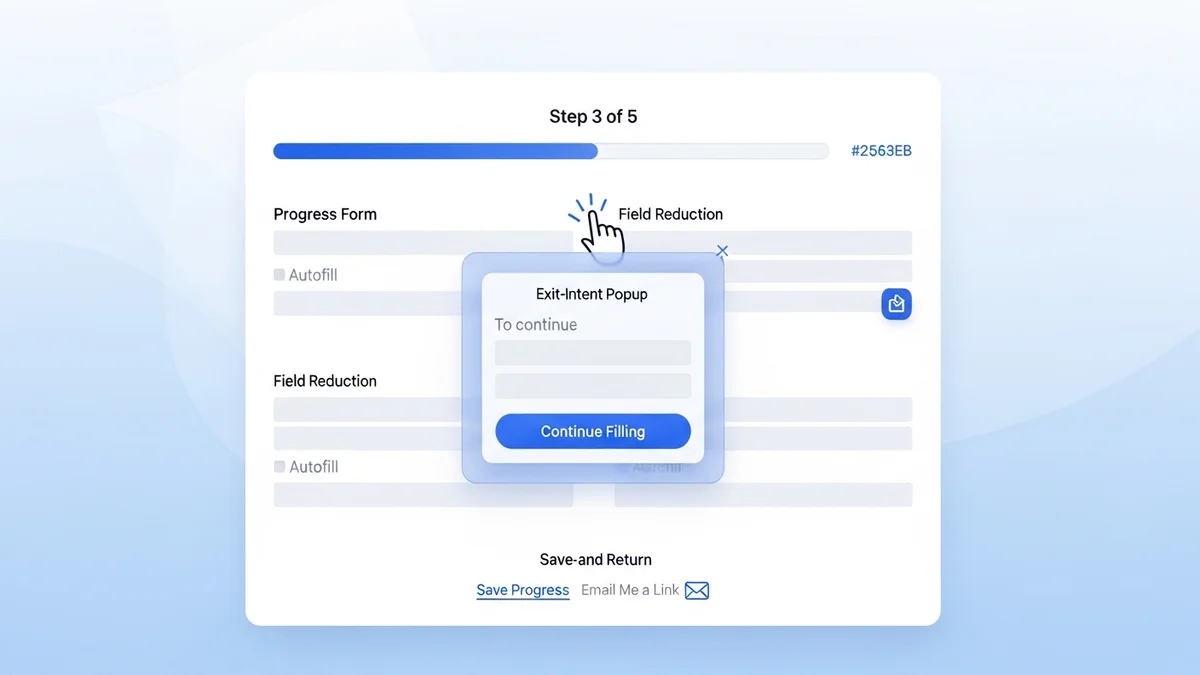
The most consistently overlooked form type is the exit-intent popup. Teams often avoid them out of concern for user experience, but when the offer is genuinely relevant and the design is clean, they recover leads who would otherwise disappear entirely. The key is specificity — a generic "subscribe to our newsletter" exit popup is annoying; a "Before you go — download the exact checklist we use to qualify leads in 48 hours" exit popup is useful.
The Best Tools for Building High-Converting Lead Capture Forms
The tool you choose determines what you can build and how fast you can iterate. Here's an honest assessment of the leading options and where each one fits.
OptinMonster — Best for Conversion-Focused Popup and Inline Forms
OptinMonster is purpose-built for lead capture conversion optimization. Its behavior-based targeting — exit intent, scroll depth, time on page, referral source — means you can match the right offer to the right visitor at the right moment. The Basic plan starts at $9/month (billed annually). For most content-driven sites where the goal is email list growth or content upgrade delivery, OptinMonster is the most cost-effective starting point. The A/B testing built into higher tiers is genuine — split-test headline copy, button color, and offer type without needing a developer.
Leadpages — Best for Standalone Landing Pages with Forms
Leadpages is the right choice when the form lives on a dedicated landing page rather than embedded in an existing site. Its Standard plan starts at $37/month and includes unlimited landing pages, pop-ups, and alert bars. The drag-and-drop builder is genuinely fast — you can stand up a converting lead capture page in under an hour without touching code. Where Leadpages earns its place is in the conversion guidance it provides: the built-in conversion rate indicators tell you whether your page is performing above or below average for its category before you've run your own tests.
Unbounce — Best for Teams Running Paid Traffic at Scale
If you're spending meaningful budget on Google or Meta ads, Unbounce justifies its Build plan price of $74/month through Smart Traffic, its AI-powered feature that routes visitors to the landing page variant most likely to convert based on their attributes. For paid acquisition teams, the difference between a 3% and a 5% landing page conversion rate represents a direct reduction in cost per lead. Unbounce's form builder is solid but not its primary differentiator — what you're paying for is the testing and routing intelligence around the form.
HubSpot Marketing Hub — Best When Forms Feed Directly Into CRM Nurture
HubSpot Marketing Hub starts at $15/month per seat at the Starter tier, with a free CRM tier that includes basic form and popup tools. The compelling argument for HubSpot is not the form builder itself — it's what happens after submission. Every form fill automatically populates contact records, triggers workflows, and updates deal stages without manual intervention. For B2B teams where lead nurture is as important as capture, keeping your form tool and your CRM in the same platform eliminates the leakage that happens every time a contact moves between disconnected systems.
Instapage — Best for Enterprise Teams Needing Collaboration and Personalization
Instapage enters at $79/month for the Create plan. It's positioned above Leadpages and Unbounce in terms of team collaboration features — real-time commenting, approval workflows, and Instablocks (reusable page and form sections) make it more practical for larger marketing teams managing multiple campaigns. Its Personalization feature, which allows you to show different form headlines and offers based on the ad segment a visitor came from, is one of the most direct ways to improve form conversion rates without changing your underlying offer.
Testing and Iterating: The Part Most Teams Skip
Building a form is the beginning, not the end. The teams generating the most qualified leads are running continuous tests. Here's a prioritized testing framework based on impact per effort:
Test Headline Copy First
The headline above your form — the value proposition — has the highest impact on whether someone reads on or bounces. Test one variable at a time: pain-focused vs. outcome-focused, question format vs. statement, specific numbers vs. general claims. Run each variant until you have statistical significance, typically 200+ conversions per variant.
Test Number of Fields Second
Remove one field from your current form and measure the conversion rate delta over two weeks. In most cases, removing a single non-essential field produces a meaningful lift. The goal is to find the minimum viable data set — what do you genuinely need to begin a sales conversation?
Test the CTA Button Third
Once headline and field count are optimized, button copy and color become the highest-leverage remaining variables. First-person copy ("Send Me the Guide") consistently outperforms second-person ("Get the Guide"). Test this hypothesis against your specific audience before treating it as universal truth.
Track Form Abandonment, Not Just Conversions
Most teams look at form submission rates and stop there. The more actionable metric is which specific field triggers abandonment. Form analytics tools and session recordings can show you exactly where people stop filling out your form — that's where you focus your next optimization effort. Given that the average CPL is now $391.80, every percentage point improvement in form completion is real money recovered from an already expensive acquisition process.
Lead capture forms are not a set-and-forget element of your marketing stack. They are the commercial handshake between your content and your pipeline — and like any handshake, the details determine whether the relationship moves forward. Build them with intention, test them with discipline, and choose tools that give you the data to keep improving.